Branding
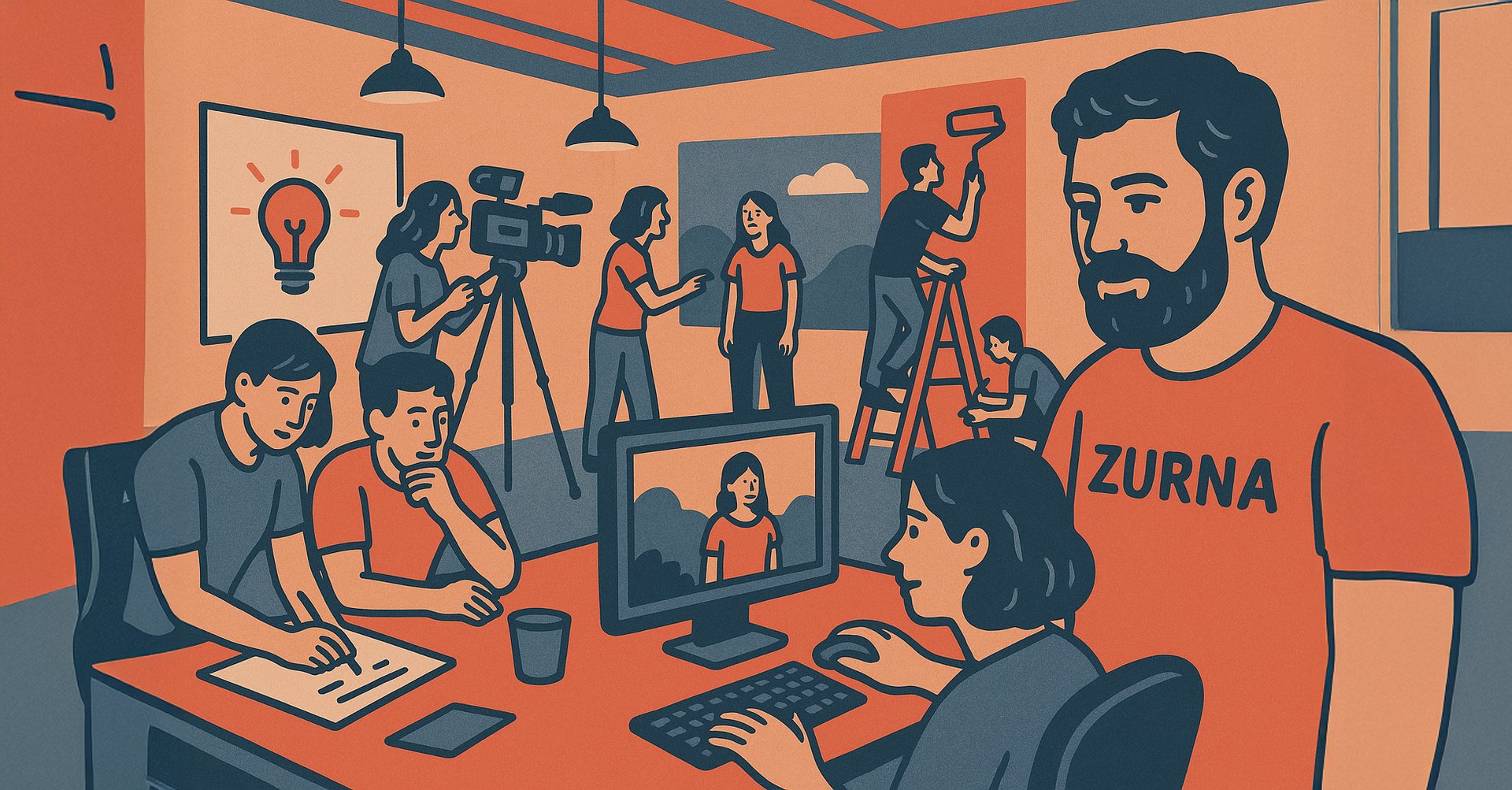
Branding is how people recognize and feel about a business—it's the look, tone, and message that makes it stand out and feel familiar, like a personality you can trust. It’s what helps someone say, “Oh yeah, I know them,” even before they try the product or service. Your logo, business colors, slogan, modeboard, fonts, Visual Style and many other elements shape your Brand identity and in Zurna, we create and bring all that under one umbrella.
”Branding is the process of connecting good strategy with good creativity”
- Marty Neumeier
Here are some of our Branding Works
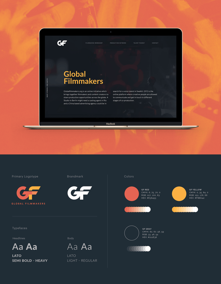
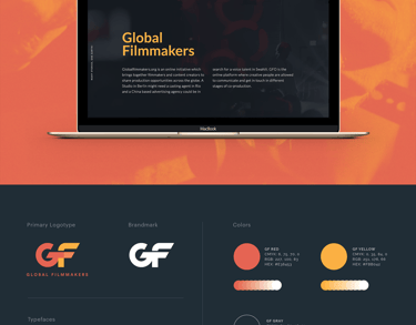
Global Filmmakers
Global Filmmakers is an international network that connects regional filmmakers and local crew to productions in need of specialized team members. Zurna Creative was in charge of logo and website design and promotional prints of this startup organization. In addition to a responsive landing page, Zurna Creative will soon support Global Filmmakers' full website with a user database which allows paid members to login and update portfolio samples.
Zurna Creative has masterfully crafted a bold and empowering visual identity for Global Filmmakers, a startup organization uniting creators across the globe. By leveraging a high-contrast palette of vibrant GF Red and optimistic GF Yellow, the branding evokes both passion and creative energy—perfect for an organization centered around collaboration and global storytelling. The deep GF Gray provides balance and sophistication, ensuring readability while allowing the accent colors to shine across digital platforms.
Typography plays a key role in Zurna’s approach, with the clean and modern Lato typeface used across headlines and body text, reinforcing accessibility and professionalism. The logomark—a striking, dynamic "GF"—stands strong both in full color and monochrome applications, ensuring flexibility and consistency. Altogether, the design system reflects the organization’s mission: a connected, forward-thinking platform that empowers filmmakers with clarity, creativity, and global reach.
Simple, firm and plain
A homage to film
Helpful Boldness
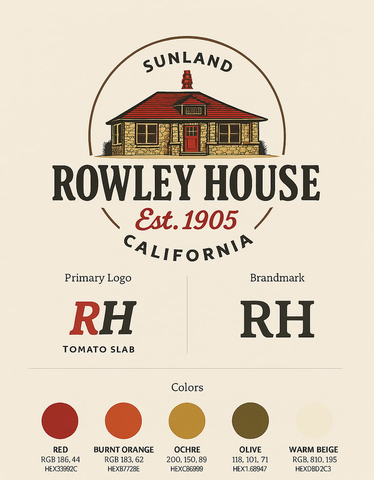
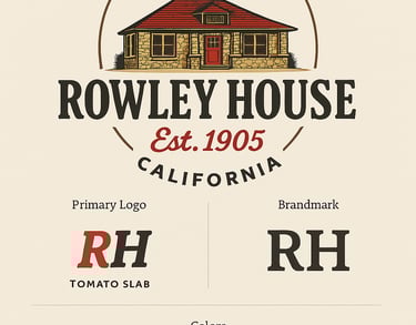
Rowley House
Zurna Creative has beautifully captured the nostalgic essence of the Rowley House in Sunland, California with a branding system that feels both historic and timeless. The design showcases a detailed illustration of the iconic Craftsman-style home, framed in a circular badge that nods to heritage signage. The warm, earthy color palette—featuring rich red, burnt orange, ochre, olive, and soft beige—evokes natural materials like brick, clay, and stone, grounding the brand in the architectural and environmental textures of the early 1900s.
Typography plays an equally important role in reinforcing the house’s legacy. The bold, slab-serif “Tomato Slab” typeface adds weight and tradition to the “Rowley House” name while remaining approachable and contemporary. Subtle design details like the curved “Sunland” and “California” placement around the mark lend a sense of place, while the tagline “Est. 1905” further cements the home's historical significance. Altogether, Zurna Creative has delivered a visual identity that feels hand-built, rooted in craftsmanship, and designed to last—just like the Rowley House itself.
A Personal Project
For the creators at Zurna Creative, the Rowley House project was a personal one as it was their cherished residence.
A Lively Inspiration
The constant presence of the old house and the energy it gave out every day definitely was a huge factor to come up with original ideas.
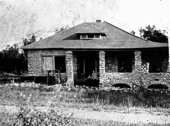
A Nostalgic Outcome
The final design certainly evoked feelings of nostalgia as the rustic fonts and a vintage drawing style took the viewers back in time.
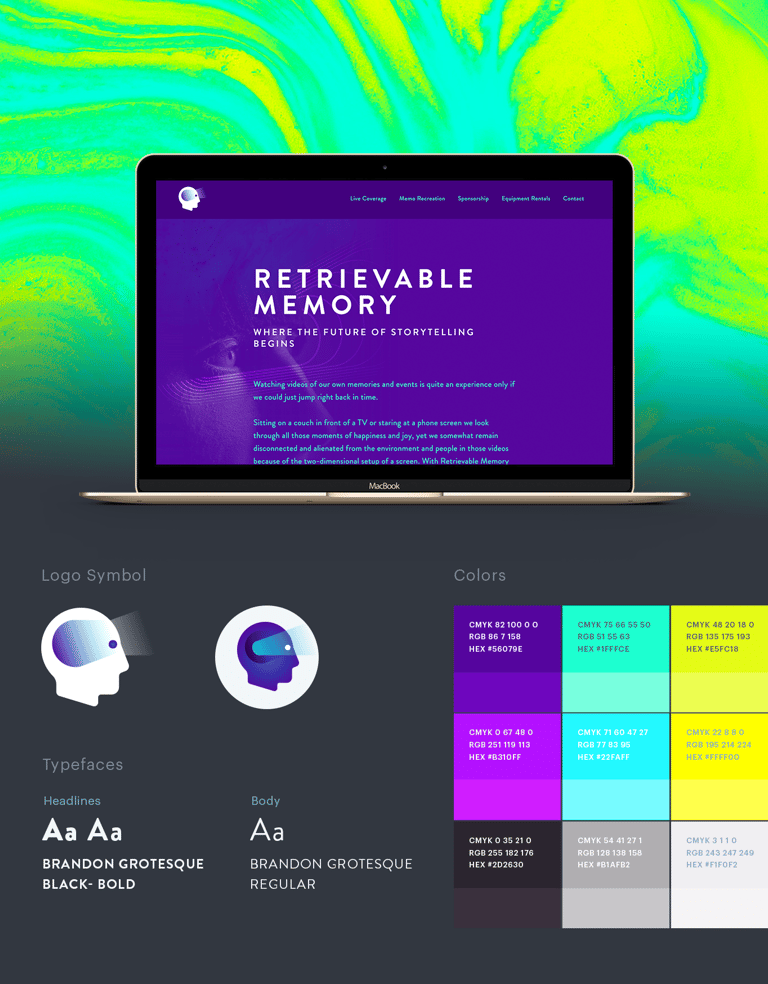
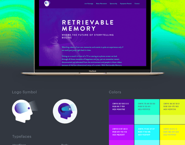
Retrievable Memory
Zurna Creative has crafted a visually striking and futuristic brand identity for Retrievable Memory, a startup tech company revolutionizing how we relive personal memories through immersive VR experiences. Anchored by a sleek, modern logo depicting a human profile interfacing with technology, the design embodies the convergence of memory and machine. The bold use of neon brights—electric blues, purples, and luminous greens—alongside deep space-inspired gradients, instantly evokes innovation and a sense of digital transcendence.
Typography further enhances the brand’s forward-thinking voice. Using Brandon Grotesque in black and bold weights for headlines establishes a clean, tech-savvy tone, while the regular style provides readability and consistency throughout the body content. The carefully curated color palette ranges from emotionally resonant purples to vibrant cyans and lime tones—mirroring the vividness of memories and the cutting-edge nature of VR. With this identity system, Zurna Creative has successfully captured the essence of a company that turns recollections into immersive, relivable moments—where storytelling meets tomorrow’s technology.
The origins of a bold idea
RM is a Bay Area based Virtual Reality content creation company specializing in production and rental services for 360 cameras of high caliber.
The Essence
Implementation of cutting edge technology of tomorrow within a new storytelling medium is what makes it an engaging project.
Collaborative Design Process
We worked collaboratively with our clients throughout the design process to ensure their vision is realized in the final product.
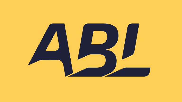
ABL Electronics
The branding guidelines for ABL Tech reflect a bold, modern identity crafted to stand out in the highly competitive world of commercial electrical services. As a Southern California-based company, ABL Tech sought a look that was clean, memorable, and vibrant—yet flexible enough to represent a range of services in a practical industry. Zurna Creative embraced the challenge, working closely with the ABL team through several concept stages before arriving at a confident and unconventional design. The final logo, with its slanted typography and high-energy motion lines, evokes movement, precision, and innovation. The unexpected color palette—ranging from vivid reds and oranges to deep navy and soft greys—adds personality while ensuring legibility across both digital and print mediums.
Through collaborative sessions, ABL’s leadership shared key insights into their brand philosophy, which Zurna translated into a visual system that feels modern but approachable. From initial sketches to polished iconography, the design process focused on marrying form and function. The result is a dynamic visual identity system that now graces ABL Tech’s full set of stationery and branding collateral, creating a unified presence that’s both energetic and professional.
A modern yet approachable look
Intentional color choices that speak louder than complexity ever could.
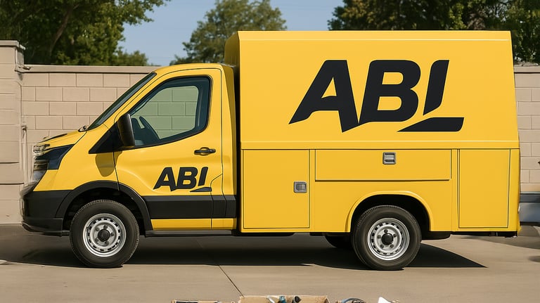
Simple to serve a full wrap of service cars
Once the design is ready, you can choose between a Full Wrap, Partial Wrap or Decal. A cost effective way to promote your business.
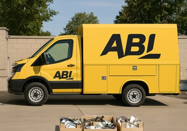
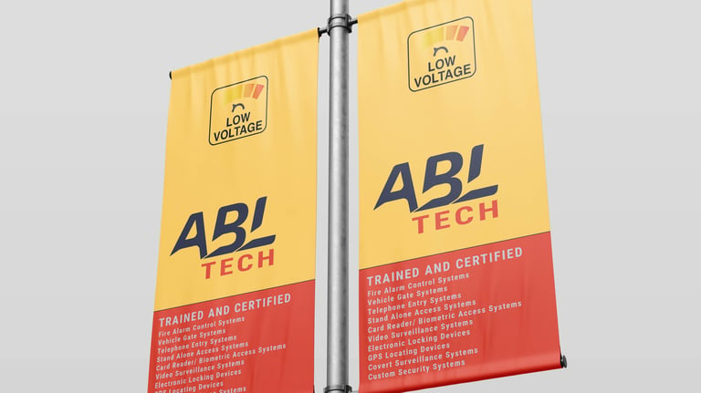
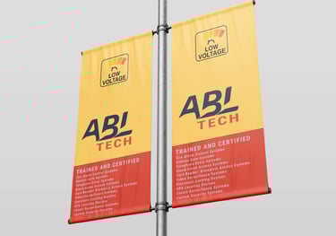
Clear and easily visible from distance
The bold contrast and vibrant colors of the design ensure high visibility and strong impact in outdoor settings, especially on printed banners.
4o